

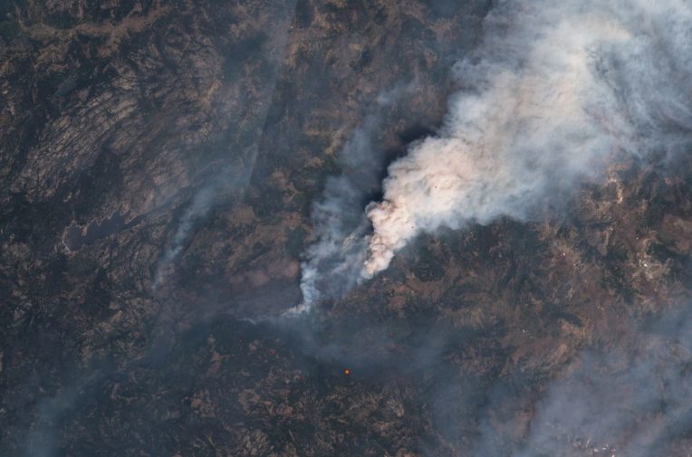
Satellite images show the Ferguson fire in California, near Yosemite National Park. Source: Sentinel-2
From California to Siberia: satellite images of wildfires around the world
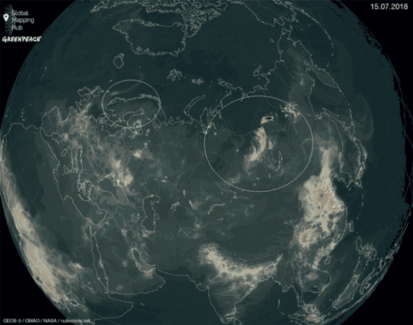
Use this map to see NASA satellite images of wildfires across the world from the last 24 hours
From California to Siberia: satellite images of wildfires around the world
Use this map to see NASA satellite images of wildfires across the world from the last 24 hours
Satellite images show the Ferguson fire in California, near Yosemite National Park. Source: Sentinel-2
As you read this, thousands of firefighters are battling the largest fire in California’s history alongside members of the national guard.
This summer, we’ve seen scenes like this across the world. From the devastating footage of people fleeing into the sea to escape wildfires near Athens, to numerous blazes within the Arctic circle.
At the moment, the environment is a tinderbox and human activity is a match
With a heatwave battering the northern hemisphere for much of the summer, 2018 has seen an unusually high number of wildfires, many in unusual areas.
Using this map, you can see satellite images from the last 24 hours of wildfires all over the world, from the historic Mendocino fire in northern California, to vast wildfires in Siberia.
What those dots mean
Before you get started, a few notes on the map.
It’s been put together by Greenpeace’s Global Mapping Hub. This international team of researchers have used a range of sources to create this project, including open source imagery from NASA and European Space Agency.
The red dots on the map don’t just mean a wildfire has occurred in that area. Rather, they show areas where the satellites have picked up a surplus of “mid-infrared energy”, or “hotspots”. The “hotspot” data is sourced from Suomi NPP (VIIRS).
Those red dots mean that a significant fire is happening somewhere within a 375m area. The satellite can also measure the amount of surplus mid-infrared energy a fire is creating. The larger the fire, the bigger the dot.
The reason so many dots appear in southern Africa is mainly because of the large amount of open agricultural and pasture maintenance burning in that region. The practise is banned in much of Europe, but proliferates in sub-saharan Africa.
The satellites can also pick up on fires from other sources like volcanos and fires from industry, so gas flares from steel works and oil rigs show up on the map – which you might be able to see a red dot over Port Talbot steelworks in south Wales.
Climate change and wildfires
“At the moment, the environment is a tinderbox and human activity is a match,” according to Jessica McCarty, a geography professor at Miami University.
“For example, many of the forest fires in Sweden were started by barbeques. So it wasn’t a lightning fork, or anything like that cause these fires: it was human activity.”
Recent warmer temperatures across the northern hemisphere have dried out the ground and caused drought, making it more susceptible to fires. In Europe and California, temperatures have hit record levels this summer.
“Warmer temperatures means more intense, longer-duration heat waves,” climate scientist Michael Mann explained. “You combine drought and intense heat you get record wildfires. It’s not rocket science.”
“Our own work suggests that stalled weather systems caused by a weakening and changing jet stream are probably playing with the unprecedented weather extremes we’re seeing around the world, with human-caused climate change playing a likely role here.
“In the case of the current California wildfires, a resilient ‘ridge’ (upward bend in the jet stream) has contributed to the persistence of the heat and drought, which has aided the development of these mega fires.”
As well as being a feature of our changing climate, wildfires also contribute to climate change by releasing greenhouse gases into the atmosphere. McCarty said she feels that some of the monitoring of emissions from fires is lacking. While international monitors like the Climate and Clean Air Coalition, which McCarty contributes to, use satellite imagery and other techniques to monitor emissions from wildfires, other bodies don’t.
“A lot of the national reporting that goes into the UNFCCC reporting really underestimates wildfires,” she argued. “There wasn’t even a peat category until 2015, and that was because of the fires in Indonesia.”
The new normal
Was this the heatwave that finally ended climate denial?
That’s what journalist Michael McCarthy asked in a Guardian comment piece as temperatures in London marched toward 35 degrees celsius.
Whatever the answer, things certainly do seem different now.In the UK, emergency services have been stretched to breaking point by fires in north Wales and Greater Manchester, while the extreme heat this summer has caused some crops to fail and forced farmers to change their habits.
“One farmer I spoke to was having to harvest his rapeseed crop at night, as it was too hot to store in the day,” Graeme Willis, food and farming campaigner at the Campaign to Protect Rural England, tells Unearthed.
When asked if we’ve reached a tipping point on our understanding and acknowledgement of climate change, Mann said: “I think so. This summer, as I have said repeatedly, we are seeing the true face of climate change. And I think people are now getting this at a gut level, as the tragedy of extreme weather events play out in real time on their television screens.”