


Satellite images show the polar vortex over the city of Toledo, Ohio. Temperatures in the region have returned to something approaching normal this week. Photo: Sentinel-2
Satellite images of extreme weather events worldwide
From the polar vortex in North America to bushfires in Australia, use this map to see images of the extreme events that have defined the start of 2019
Satellite images of extreme weather events worldwide
From the polar vortex in North America to bushfires in Australia, use this map to see images of the extreme events that have defined the start of 2019
Satellite images show the polar vortex over the city of Toledo, Ohio. Temperatures in the region have returned to something approaching normal this week. Photo: Sentinel-2
The start of 2019 has been marked by extreme weather across the world, sparking concerns that climate change could be accelerating.
Using our map you can see these events play out in close to real time. The map shows satellite images from the last 24 hours, so you can see pictures from the polar vortex hitting the Midwest in the United States, to wildfires devastating Tasmania.
Can the world still be getting warmer when people are dying from cold in the US?
January was Australia’s hottest month on record. The temperatures were so high halted play was temporarily halted at the Australian open tennis tournament and caused hundreds of thousands of fish to die in the rivers of New South Wales.
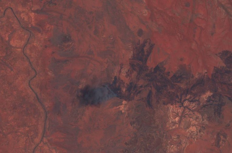
Meanwhile, almost 200,000 hectares of land in Tasmania has been burnt out over the last six weeks, as state officials have battled an unprecedented bushfire crisis.
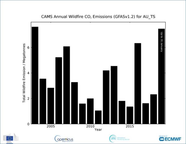
CO2 emissions from fires in Tasmania in January 2019 already surpass total emissions from all years going back to 2003, according to an analysis by Copernicus Atmosphere Monitoring Service implemented by European Centre for Medium-Range Weather Forecasts.
While temperatures soared in the southern hemisphere, they plummeted in the United States. Chicago was colder than the Arctic last week, prompting this tweet from Donald Trump.
In the beautiful Midwest, windchill temperatures are reaching minus 60 degrees, the coldest ever recorded. In coming days, expected to get even colder. People can’t last outside even for minutes. What the hell is going on with Global Waming? Please come back fast, we need you!
— Donald J. Trump (@realDonaldTrump) January 29, 2019
He’s right, it’s cold, not warm and global warming is a phrase that has warm in it. So what’s going on? Are these strange weather events isolated incidents or the sign of a broader trend?
You might have read about the polar vortex in recent days. The polar vortex is a strong band of cold air that ensures that the extreme cold temperatures in the North Pole stay locked in the Arctic region. The Guardian has a detailed explanation of it here.
Climate change has caused the Arctic to become warmer, reducing the difference between temperatures at the poles and the equator.
In recent years, scientists have come to understand that the warming of the Arctic has displaced the polar vortex to more populated areas further south.
Climate scientist Michael Mann explains:
“There is a growing body of evidence that the amplified warming of the Arctic caused by climate change, by reducing the temperature contrast between the equator and pole, is essentially slowing down the jet stream and causing larger north-south meanders. That makes it easier for pieces of the cold Arctic air masses to break off and wobble down into middle latitudes, like we’re seeing with this current cold air outbreak. There is still some debate within the community about this connection, but the evidence does appear to be growing stronger and we’re potentially moving toward a consensus on this.”
“Basically, the amplified Arctic warming decreases the contrast in temperature between the equator and pole, weakening the jet stream, and favoring a particular type of behavior where the jet stream undulations become magnified, which gives you very persistent extreme high and low pressure associated with extreme heat/drought in some areas and extreme rainfall in other areas.
“This effect is in addition to the obvious effect that warmer temperature overall gives you more frequent and intense heat waves, and might explain why we’re seeing more extreme heat waves than we would expect simply from the consequence of the overall increase in temperatures alone.”
Unearthed video: How forest fires can help melt ice sheets thousands of miles away
How the map works
You can use it to see satellite images from the last 24 hours, from all over the world.
It’s been put together by Greenpeace’s Global Mapping Hub. This international team of researchers have used a range of sources to create this project, including open source imagery from NASA and the European Space Agency.
To see the satellite images, change the basemap to ‘satellite imagery’.
The red dots on the map don’t just mean a wildfire has occurred in that area. Rather, they show areas where the satellites have picked up a surplus of “mid-infrared energy”, or “hotspots”. The “hotspot” data is sourced from Suomi NPP (VIIRS).
Those red dots mean that a significant fire is happening somewhere within a 375m area. The satellite can also measure the amount of surplus mid-infrared energy a fire is creating. The larger the fire, the bigger the dot.
The reason so many dots appear in southern Africa is mainly because of the large amount of open agricultural and pasture maintenance burning in that region. The practise is banned in much of Europe, but is common in sub-Saharan Africa.
The satellites can also pick up on fires from other sources like volcanos and fires from industry, so gas flares from steel works and oil rigs show up on the map – which is why you might be able to see a red dot over Scunthorpe Steelworks in south Yorkshire.