

Mapped: nitrogen dioxide pollution around the world
From cities in Europe to wildfires in Africa, data from a new European Space Agency satellite reveals the scale and spread of NO2 on a global scale
In the last few years, governments and corporations around the world have come under increasing pressure to act on a global air pollution crisis.
In Europe, nitrogen dioxide (NO2) has been at the centre of the debate, following the dieselgate scandal and numerous legal battles faced by governments that have been shown to be in breach of legal limits.
As the World Health Organisation hosts its first global air pollution conference, new satellite data reveals the scale and spread of global NO2 on an unprecedented scale, from lignite power plants in Europe to wildfires in Africa.
Mapped against known pollution sources, it shows that NO2 pollution doesn’t come from diesel pollution alone; it is also emitted by coal, oil, gas and biomass plants as well as forest fires and crop burning.
What do the clouds and the coloured dots show?
Greenpeace has mapped the European Space Agency (ESA) data against known NO2 pollution sources using data from the European Commission’s Emissions Database for Global Atmospheric Emissions Research, the CoalSwarm Global Coal Plant Tracker, the WRI Global Power Plants Database and other satellite data.
The coloured clouds show all the NO2 in the global troposphere; that’s the lowest (and largest) layer of the Earth’s atmosphere, which extends from ground level, 10km upwards.
The darker – or pinker – the cloud, the higher the concentration of NO2 in an area, measured in Dobson units (DU). It reflects the total amount of gas in the atmosphere above a certain location.
The data used is an average of measurements taken on a daily basis over a three month period from June to August 2018, by the ESA’s new Sentinel 5P satellite, which was launched last October. It passes over every location on Earth once a day, around noon local time.
The coloured dots on the map show the locations of power plants, revealing the impact of China’s vast coal industry to Germany’s famously polluting lignite plants to the lesser known oil plants and refineries of the Middle East and North Africa. The data is the most recent available, but does not cover gas plants below 1000MW or coal and oil plants below 200MW.
What the map means – and what it doesn’t
Because the DU measures the total number of molecules in a vertical column, it is not the same as the concentrations at ground level.
That means it is difficult to draw any specific health conclusions from this data, because the pollution shown is distributed at different heights in the atmosphere. Some is emitted at ground level (for example from transport) where people are or in cities where buildings make it difficult for the pollution to disperse. Other hotspots on the map are from power plants that emit NO2 at a much higher level.
That’s not to say that pollution from such sources doesn’t have an impact on human health. While those closest to the source are most at risk, pollution can travel hundreds of kilometres – including across borders – depending on weather conditions, the geography of an area and the height of a pollution smokestack.
For example, tens of thousands of premature deaths have been attributed to pollution from Europe’s coal plants.
NO2 also has a detrimental effect on biodiversity, inhibiting plant growth. In the UK, it’s been estimated that (pdf) 63% of the most sensitive wildlife habitats have been affected by excessive nitrogen deposits.
It’s also worth noting that the map’s measurements were taken over the summer, so emissions could vary at other times, particularly if the sources are from seasonal events, such as forest fires or agricultural burning.
While emissions from power plants and roads are likely to stay pretty stable year round, pollution is also often worse on the ground in winter, when the cold and still air can prevent it dispersing.
Fossil fuels
In China, it’s easy to see that despite concerted efforts (pdf) to cut emissions from coal, NO2 pollution is still a chronic problem. It’s also an important factor in why the country is still plagued by serious particle pollution; NOx forms small particles in the atmosphere contributing to the formation of ozone and particulates.
Meanwhile in Europe, the lignite-fired power plants in Germany’s industrial region near Cologne stand out, alongside clusters of coal plants in Poland.
The data also sheds a light on the under-reported pollution hotspots in the Middle East and North Africa, a region home to very high oil consumption and poor emission standards. Desert dust is a well known source of particle pollution in the region, but the satellite data reveals that oil-fired power plants, refineries and transport are key sources too.
The map also points to the impact of emissions regulations in some places. While there are plenty of coal plants in the US, NO2 concentrations near plants in India, South Africa, Australia and Indonesia stand out much more. In these countries, there has been a failure to enforce meaningful pollution standards, or to implement them.
From the city to the country
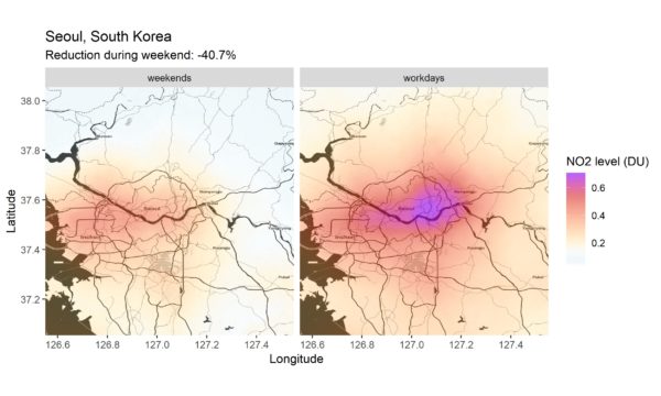
It’s not hard to spot the megacities on the map, where transport is the main source of emissions. From Santiago to Seoul, via London and Paris, the map reveals the toll that cars and trucks exact on air quality.
One way to measure the impact of transport on air quality is to compare pollution levels during weekdays and weekends, when there is usually less traffic. In the bigger cities, this comparison shows dramatic drop-offs in pollution, such as in Seoul, South Korea.
There are also some hotspots in rural areas where there are few power plants, most notably over the Democratic Republic of Congo, Angola and far eastern Russia. Here fire detections from satellites show that pollution can be attributed to forest fires and crop burning.